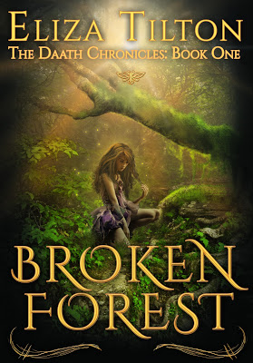
If you haven’t noticed, BROKEN FOREST had a book cover change, before I get into the WHY, take a peek at the new cover.
Isn’t it pretty? When my publisher discussed a cover change, I was a bit hesitant. I LOVED my cover and so did my publisher, but we had this tiny teensy issue: readers thought it was manga.
Manga is great, but that’s not what I write and we didn’t want potential readers to miss out on the awesome that is BROKEN FOREST. After much discussion and feedback we decided to make a cover change.
I think it worked out pretty good. Don’t you?
And did you notice the subtitle? That’s right folks. I’m working hard on book#2.


This is a great cover, I think the change was definitely worth it!
Yeah. I think it really captures the essence of the story.
love the new cover! the old one was a little dark for my preferences, but this is beautiful!
that's what the lady in the bookstore at my church said when I brought it in O.o lol
I love it! How exciting
thanks you!
The new cover is gorgeous! Definitely eye-catching. I agree that the old cover did look like Manga. I think this one will sell better.
I have a good feeling about it!
Oh my goodness, Eliza– that is downright GORGEOUS! I think it looks fantastic. :0) I didn't think Manga when I saw the other one… until you mentioned it. Now I totally see what you mean. I think this cover is much better. YAY!
It's awfully pretty : )
Lovely cover–not sure I ever saw the first.
thanks!